Pulsator for Flutter
The Pulsator Flutter package brings a captivating pulsating animation to your Flutter applications.
Installation
To integrate the Pulsator package into your Flutter project, add the following dependency to your pubspec.yaml file:
dependencies:
  pulsator: ^1.0.0
After making the modification, run the following command in your terminal:
flutter pub get
Introduction
The Pulsator package introduces two primary widgets: Pulsator and PulseIcon.
Pulsator Widget
The Pulsator widget allows you to create pulsating animations with customizable styles. You can control the number of pulses, animation duration, repetition, and more. This widget is perfect for adding dynamic visual effects to specific areas of your app.
Pulsator(
  style: PulseStyle(color: Colors.blue),
  count: 5,
  duration: Duration(seconds: 4),
  repeat: 0,
  startFromScratch: false,
  autoStart: true,
  fit: PulseFit.contain,
  child: YourContentWidget(),
)
PulseIcon Widget
The PulseIcon widget simplifies the process of displaying an icon with a pulsing effect. It allows you to customize the pulse and icon properties effortlessly.
PulseIcon(
  icon: Icons.favorite,
  pulseColor: Colors.red,
  iconColor: Colors.white,
  iconSize: 44,
  innerSize: 54,
  pulseSize: 116,
  pulseCount: 4,
  pulseDuration: Duration(seconds: 4),
)
Features
- Customizable Styles: Tailor the pulse animation to your preferences with adjustable color, size, and gradient configurations.
- Dynamic Pulse Effects: Create dynamic and visually appealing pulsating animations that draw attention to specific elements in your UI.
- Icon Integration: Easily incorporate pulsating effects into your icons using the
PulseIconwidget for a more engaging user experience. - Flexible Configuration: Fine-tune the pulse behavior by adjusting parameters such as count, duration, repetition, and more.
Usage
Explore the various properties and customization options provided by the Pulsator and PulseIcon widgets to seamlessly integrate pulsating animations into your Flutter application. Experiment with different configurations to achieve the desired visual impact and enhance the overall user experience.
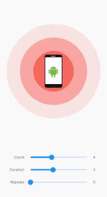
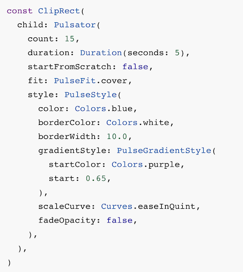
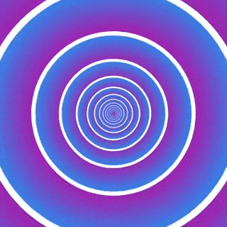
Juicy examples
| Code | Preview |
|---|---|
 | 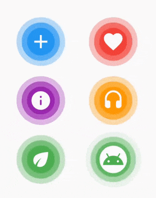 |
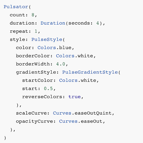 |  |
 |  |
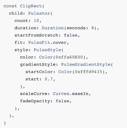 | 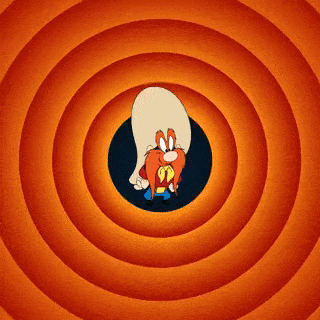 |
License
This project is licensed under the MIT License – see the LICENSE file for details.
Contributing
Please read CONTRIBUTING.md for details on my code of conduct, and the process for submitting pull requests to me.
The docs, please!
Pulsator Widget properties
| Property | Type | Description |
|---|---|---|
style | PulseStyle | Pulse style configuration. Required. |
count | int | Number of pulses visible at a time. Default is 3. |
duration | Duration | Duration of a single pulse animation. Default is 2 seconds. |
repeat | int | Number of times pulses will repeat. If 0, pulses will repeat forever. Default is 0. |
startFromScratch | bool | Whether the animation should start from the beginning. Default is true. |
autoStart | bool | Whether the animation should start automatically when the widget is created. Default is true. |
fit | PulseFit | How the pulse should be scaled to fit the widget size. Default is PulseFit.contain. |
child | Widget? | The child of the widget that is rendered on top of the pulses. Default is null. |
Events
| Event | Description |
|---|---|
onCreated | Invoked when the animation controller is created. |
onCompleted | Invoked when the animation is completed. |
PulseIcon Widget properties Pulsator Flutter package
| Property | Type | Description |
|---|---|---|
icon | IconData | The icon to display. Required. |
pulseColor | Color | The color of the pulse. Required. |
iconColor | Color | The color of the icon. Default is white. |
iconSize | double | The size of the icon. Default is 24. |
pulseSize | double | The size of the pulse. Default is 64. |
innerColor | Color? | The color of the inner, non-pulsing circle. Default is null. |
innerSize | double? | The size of the inner, non-pulsing circle. Default is null. |
pulseCount | int | The number of pulses to display. Default is 3. |
pulseDuration | Duration | The duration of a single pulse animation. Default is 4 seconds. |
PulseStyle properties
| Property | Type | Description |
|---|---|---|
color | Color | Main pulse color. Default is Colors.red. |
borderColor | Color? | Pulse border color. If null, no border will be rendered. Default is null. |
borderWidth | double? | Pulse border width. If null, no border will be rendered. Default is null. |
gradientStyle | PulseGradientStyle? | If set, the pulse will be rendered as a gradient. Default is null. |
pulseCurve | Curve | Pulse scale animation curve. Default is Curves.linear. |
opacityCurve | Curve | Pulse opacity animation curve. Default is Curves.linear. |
fadeOpacity | bool | Whether the opacity should be animated from 1.0 to 0.0. Default is true. |
startSize | double | The size of the pulse when it begins, as a fraction of the pulse radius. Default is 0.0. |
PulseGradientStyle properties
| Property | Type | Description |
|---|---|---|
radius | double | The radius of the gradient, as a fraction pulse radius. Default is 0.5. |
start | double | The start point of the gradient, as a fraction of the pulse radius. Default is 0.0. |
end | double | The end point of the gradient, as a fraction of the pulse radius. Default is 1.0. |
startColor | Color? | The start color of the gradient. If null, the pulse color will be used with the opacity set to 0.0. Default is null. |
reverseColors | bool | Whether the gradient colors should be reversed. If true, the gradient will start from end and end at start. Default is false. |
PulseFit enum
| Value | Description |
|---|---|
contain | The pulse will be scaled to fit the widget size. |
cover | The pulse will be scaled to fill the widget size. |
Resources Used:
You can check out the entire code of this App here:
Get Full Source Code
Conclusion
This was all about a quick go through the basic flutter App UI Screen. If you need any assistance regarding flutter app development, you can consult a flutter developer from FlutterDesk. We would love to be of help. Still, if you feel any difficult while dealing with Flutter app development projects, you can reach out to us or hire Flutter developers to outsource any of your app development project.
Do like & share my Facebook page. if you find this post helpful. Thank you!!
Happy coding! 😉
Related Articles:
- How to Install Flutter in windows 10
- Quiz App using flutter with source code
- Flutter music app Search all audio files in android phone
- Flutter NEWS App with REST APIs source code
- Chat GPT Voice Chatbot App with Flutter source code
- Make News and Weather App using flutter
- A Flutter News Application created with source code
- Wallpaper App with awesome wallpapers Made using Flutter
- A Flutter MCQ quiz app with firebase google login
- Text to Mental Health Detection using Machine Learning
- Message Chat App with Firebase using flutter
- Flutter BottomNavigationBar Example UI with source code
- Flutter Animated collapsible app drawer with source code
- Messaging Chat App Using Flutter source code
- Quiz maker app made with Flutter and firebase source code